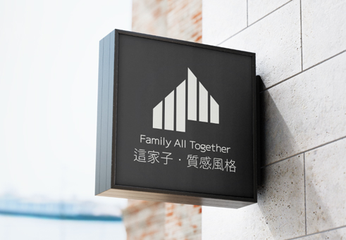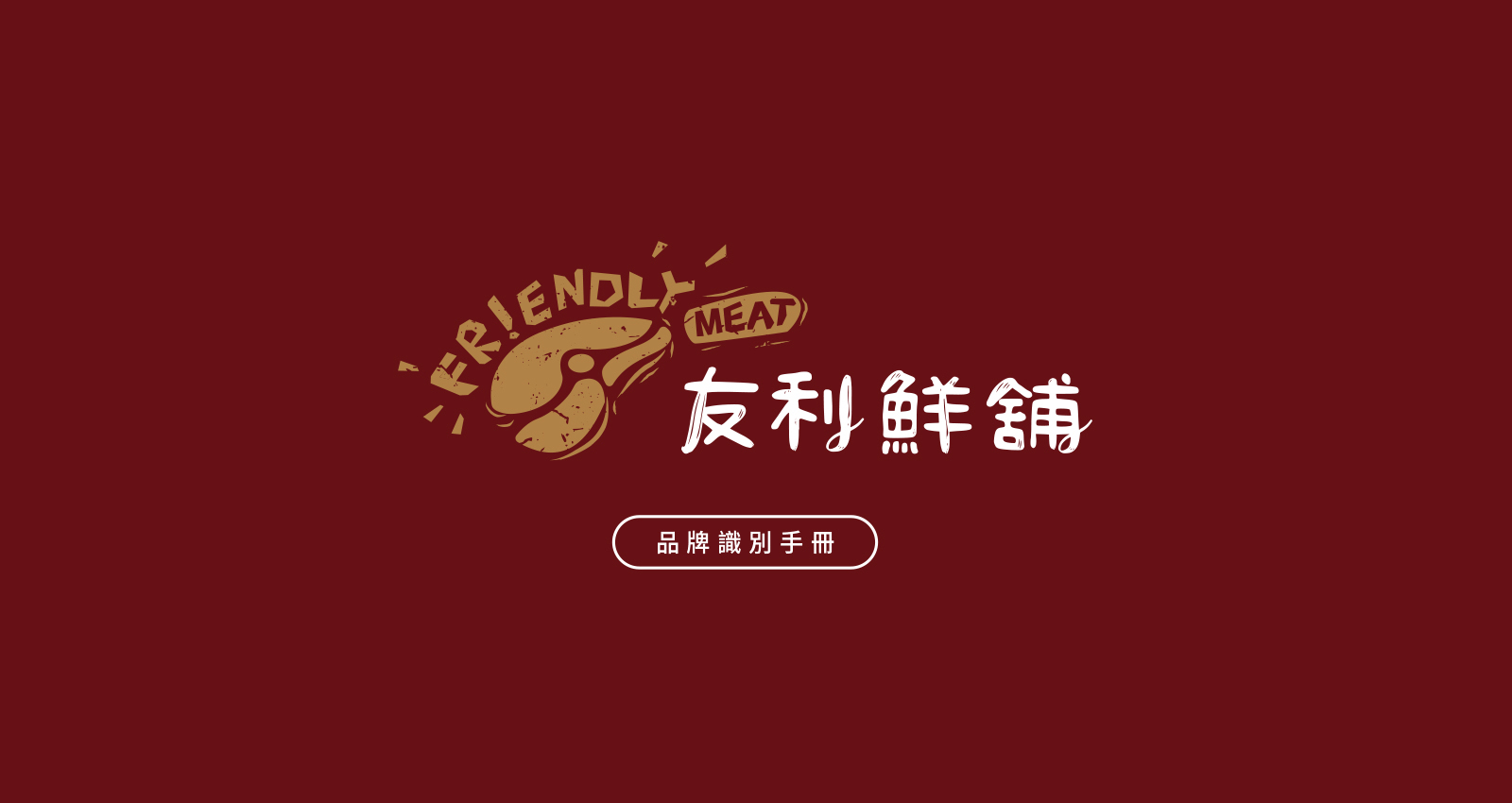
品牌重塑 3 大關鍵策略|友利鮮舖的識別進化之路
✦ 品牌為什麼需要重塑形象?
隨著市場的進化與消費者的期待提升,品牌不僅是一個標誌,更是對品質的承諾和情感的橋樑。對於在地耕耘近20年的友利鮮舖而言,品牌重塑是一次以全新姿態擁抱未來的契機!
✧ 品牌簡介
友利鮮舖自成立以來,一直致力於提供高品質的肉品,為家庭與餐廳提供卓越服務,已經超過二十年。從最初的單純肉品銷售,到如今融入在地故事並結合精緻包裝的品牌化經營,友利鮮舖始終秉持著「新鮮·真誠」的經營理念,深得消費者信賴。 為了滿足新一代消費者對高品質與視覺美感的雙重需求,友利鮮舖與 IN DESIGN 英式設計 攜手合作,進行品牌重塑,從在地經營出發,打造更具現代感與吸引力的品牌形象,並提升品牌在市場中的競爭力,為未來發展奠定堅實的基礎。
✧ 識別重塑策略
友利鮮舖的品牌重塑著眼於以下三大核心:
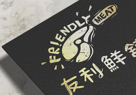
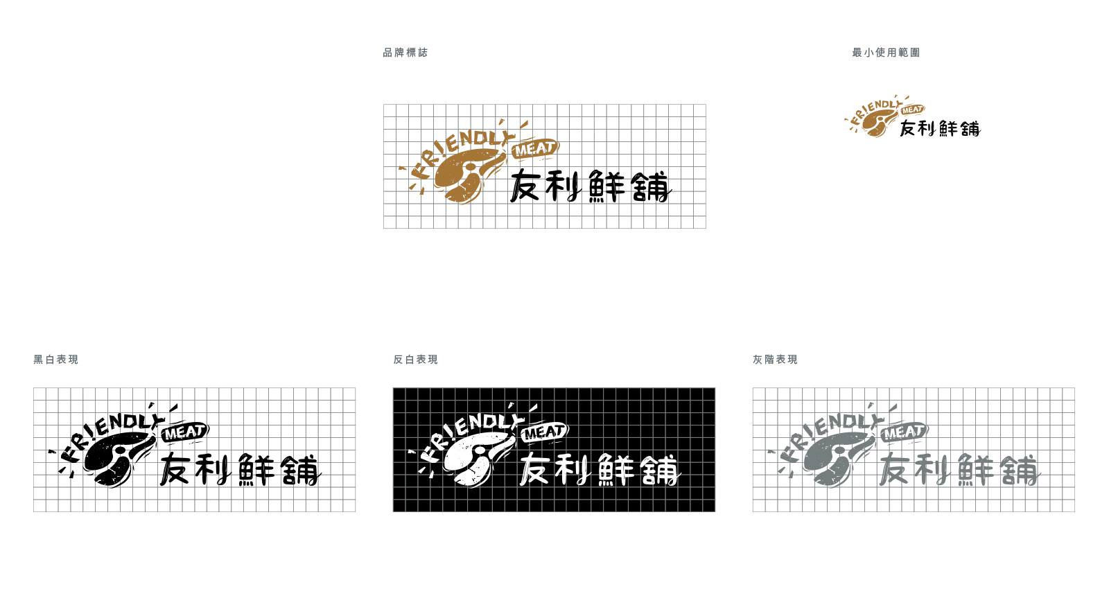
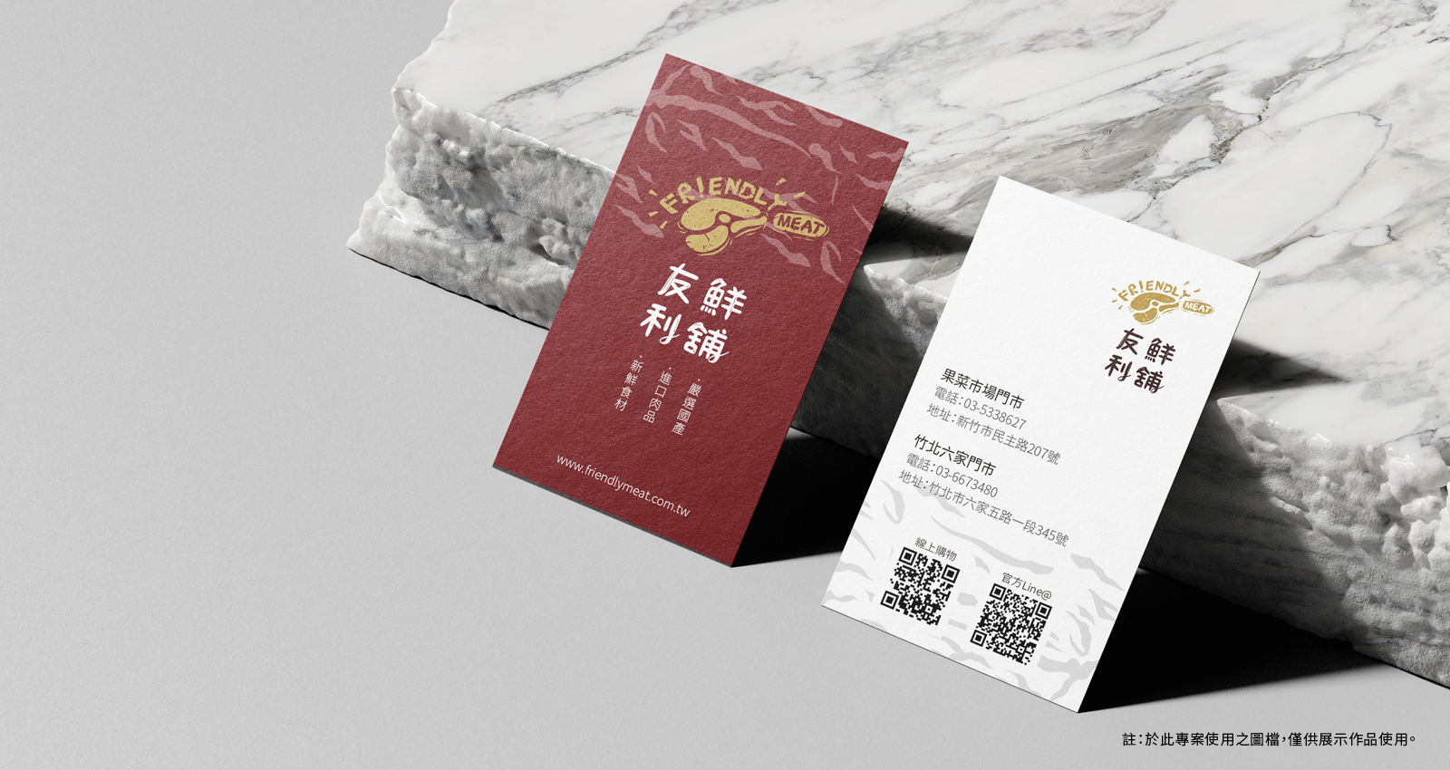
標誌設計|傳承與現代的融合
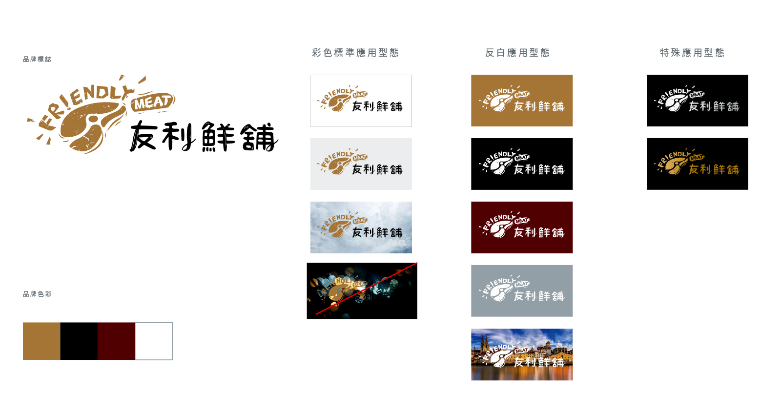
新標誌保留了友利鮮舖的中文名稱,並加入風格化的肉品圖標與「Friendly Meat」字樣。設計中以輕鬆自然的筆觸呈現肉品與刀具的結合,展現品牌的歷史厚度與溫暖人情。色彩策略|層次分明的視覺衝擊
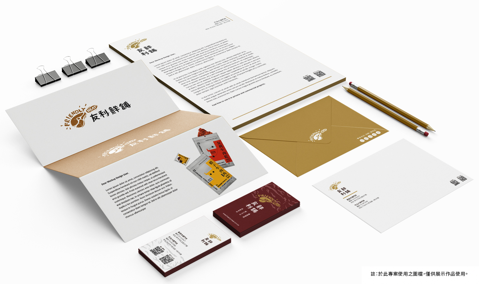
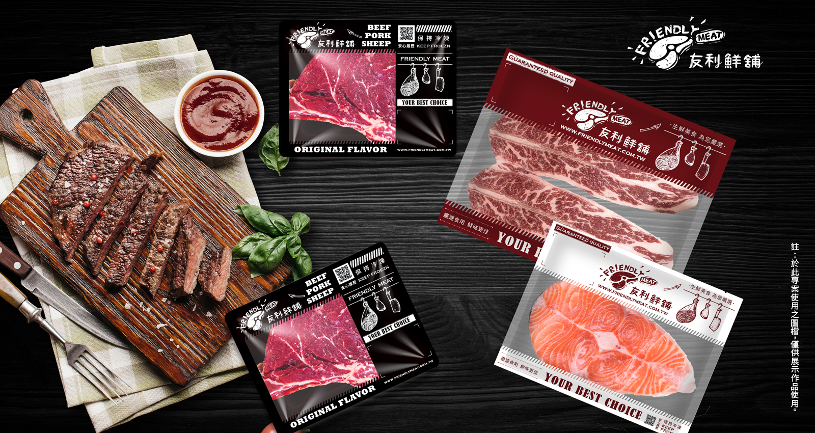
在保留金棕色的基礎上,引入對比強烈的黑色與點綴的紅色,重新演繹肉品的專業與高端質感。尤其在包裝設計上,紅色的運用讓產品更加吸睛,也為品牌注入更多活力。包裝與店面設計|一致的品牌體驗
舊包裝偏向單一的金色設計,而新設計強調黑色背景搭配高質感的肉品照片,呈現更專業、更誘人的形象。同時,店面招牌則以新標誌搭配醒目的紅色強調色,增強品牌識別度。The rebranding of Friendly Meat combines modern design with brand heritage. The logo evolved from a simple animal icon, incorporating realistic meat and knife imagery alongside the text "Friendly Meat," emphasizing both tradition and international appeal. The color scheme retains the original golden-brown tone while introducing black and red for a more premium and appetizing look. The new signage simplifies the design, focusing on the logo and red accents to enhance brand recognition. The packaging now features a black background with vivid meat imagery, creating a more enticing visual. Butcher tool illustrations further highlight the handcrafted quality, elevating the overall brand image.
友利鮮舖のリブランディングは、現代的なデザインとブランドの伝統を融合しています。ロゴはシンプルな動物アイコンから進化し、肉と包丁の具象的なイメージと「Friendly Meat」の文字を組み合わせ、伝統と国際的な魅力を強調しています。カラーは金茶色を基調に、黒と赤を加えて、より高級感と食欲をそそる外観に仕上げました。新しい看板はデザインを簡素化し、ロゴと赤いアクセントを強調することでブランド認知度を高めました。パッケージは黒を背景に肉の写真を使用し、より魅力的なビジュアルを作り上げています。
Work Scope
品牌識別設計
平面文宣設計
店面視覺規劃
註:於此專案使用之圖檔,僅供展示作品使用。