性平竹幸福_識別系統
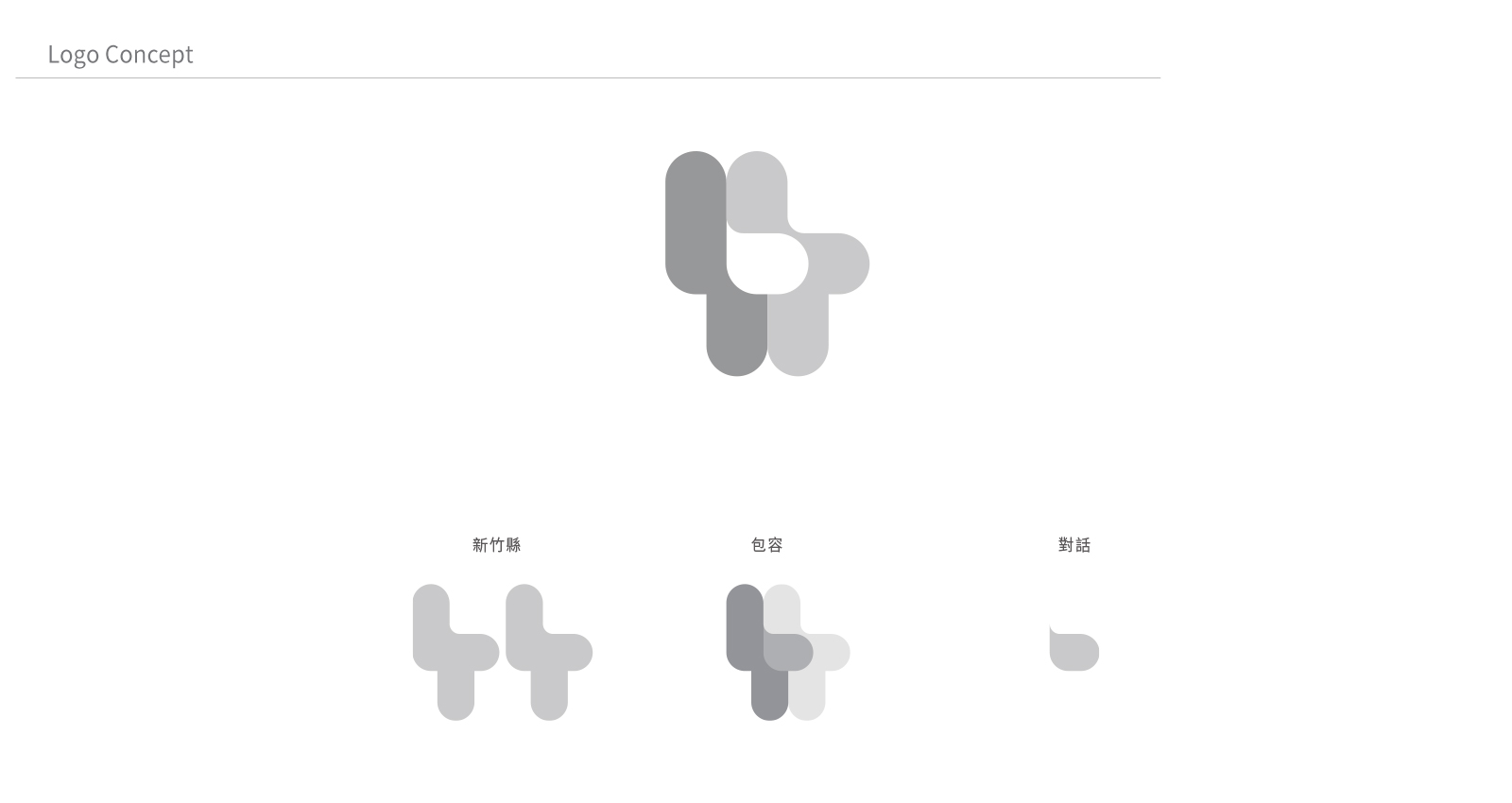
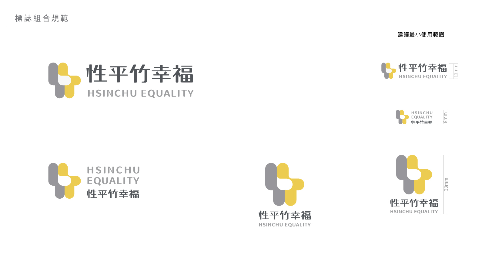
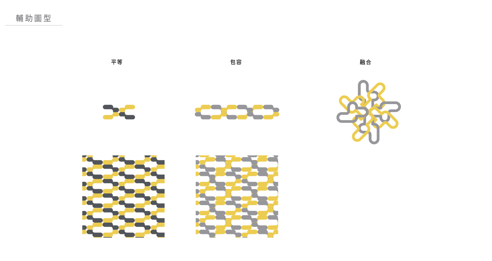
性平竹幸福標誌是取材新竹縣的象徵「竹」字為基礎,設計出一個充滿對話空間感的標誌,象徵著性平與幸福。由兩個單位重疊後,呈現出包容與融合的意象,同時彰顯了不同意見間的對話與溝通。
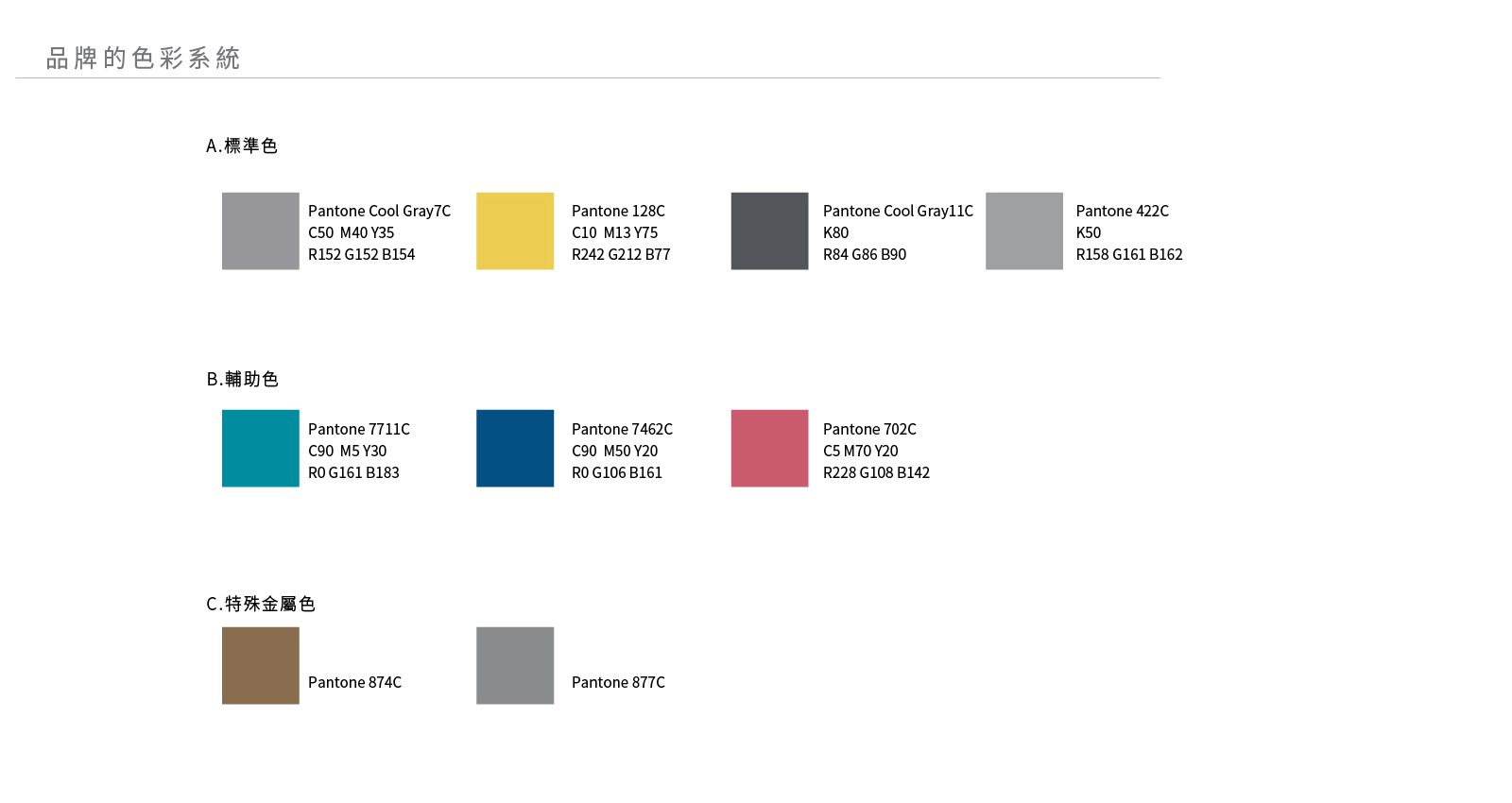
色彩方面,色彩的心理感受,使用「灰色」與「黃色」二種風格迥異的中性色,「灰色」傳達出沉穩的氣息,「黃色」則是充滿著活力與熱情,當二種顏色正向的結合後,便能傳達出令人幸福的感受。
既展現了對多元觀點的尊重與包容,也傳達了溝通與傾聽的重要性,為性平與幸福的價值觀提供了有力的視覺表達。
design concept| 品牌識別設計
Symbol of Gender Equality and Happiness
The "Gender Equality and Happiness" logo is derived from the character "竹" (bamboo), which is a symbol of Hsinchu County. The design creates a logo with a sense of dialogue and space, symbolizing gender equality and happiness. The overlapping of two units represents inclusiveness and integration, while highlighting dialogue and communication between differing opinions.
Colors and Psychological Effects
The color scheme employs two contrasting neutral tones: "gray" and "yellow." Gray conveys a sense of stability and calm, while yellow is full of vitality and enthusiasm. When these two colors combine positively, they evoke a sense of happiness.
This design not only showcases respect and inclusiveness for diverse perspectives but also emphasizes the importance of communication and listening. It provides a powerful visual representation of the values of gender equality and happiness.
Work Scope
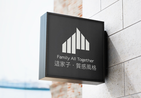
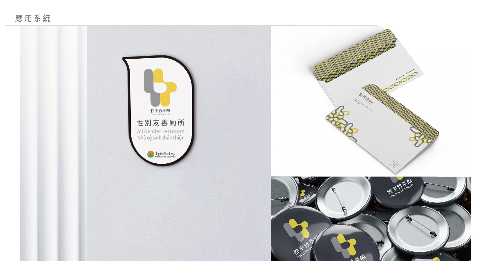
指示牌設計
註:於此專案使用之圖檔,僅供展示作品使用。