苗栗縣公共圖書館│識別提案│
Work Scope
形象識別系統(CIS)設計規劃
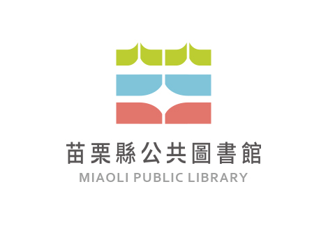
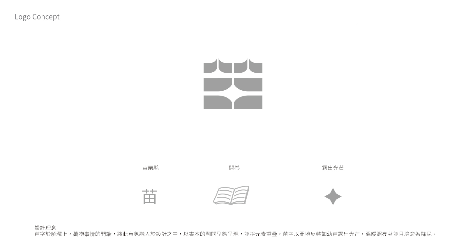
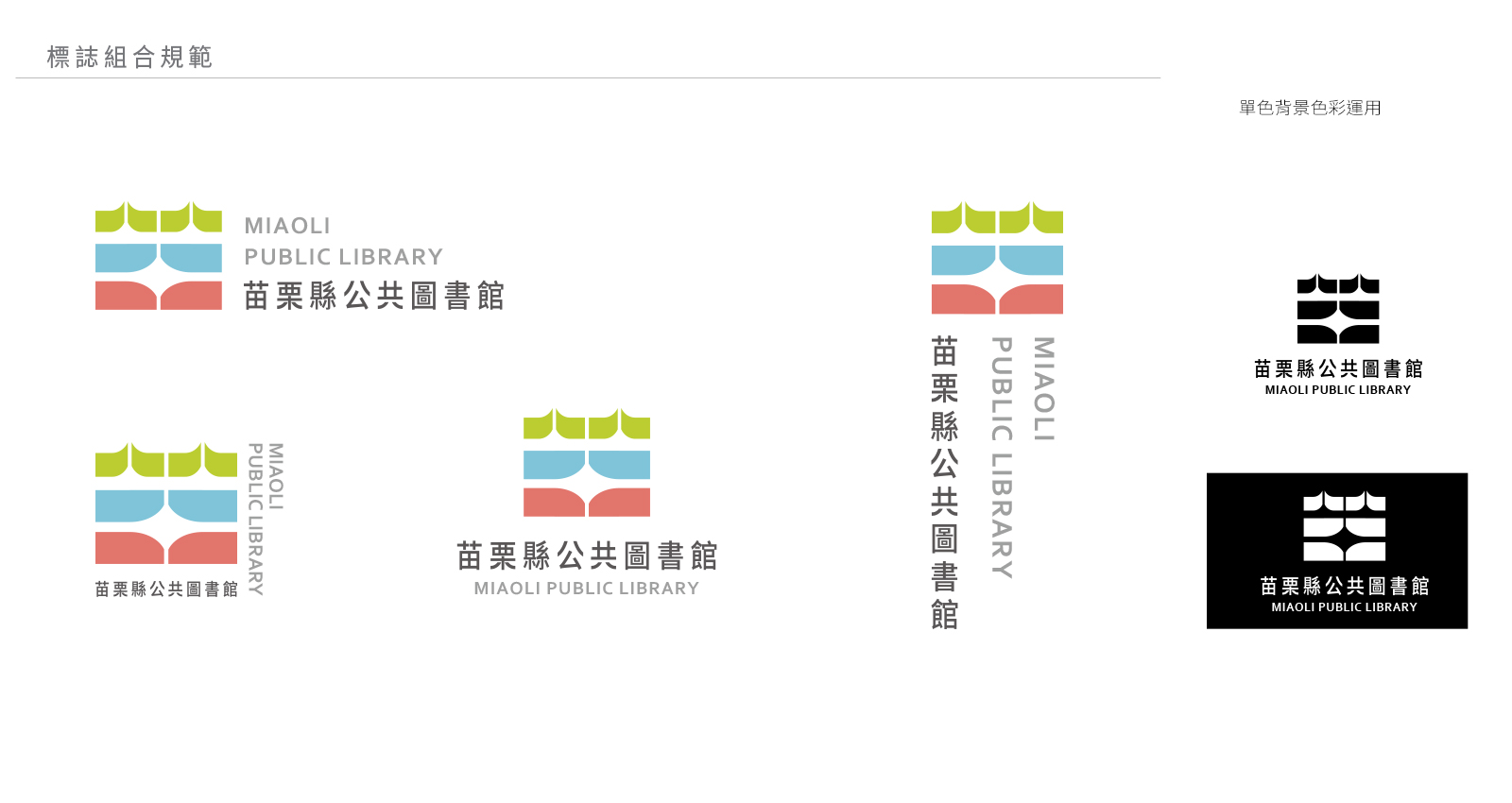
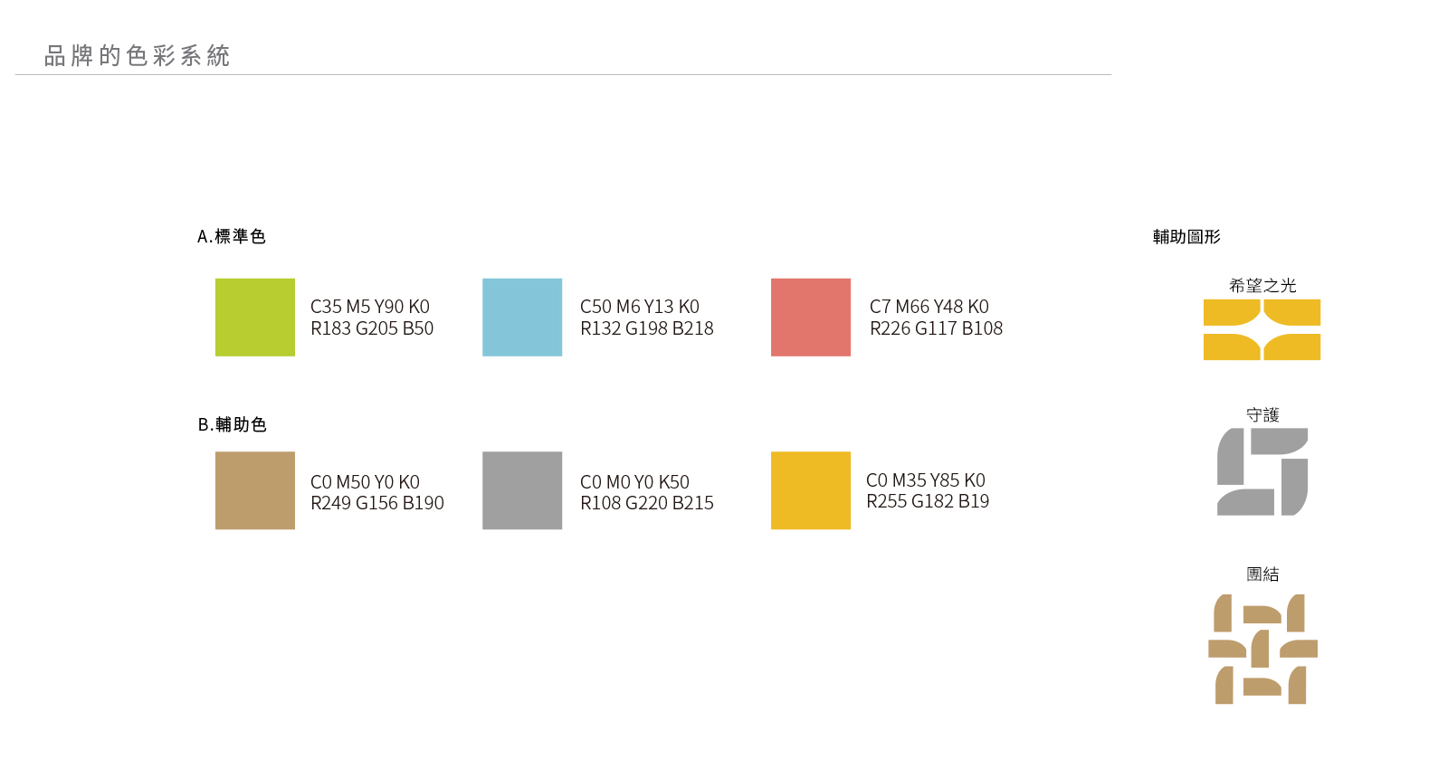
苗栗縣公共圖書館的LOGO設計靈感來自於書籍和自然元素的結合。LOGO的上半部分象徵著「苗」,代表著苗栗縣的文化根基和自然環境;下半部分則模擬了打開的書本,象徵著知識的傳遞與開展。整體造型簡約大方,以幾何圖形的方式呈現,強調圖書館作為知識與文化傳播中心的定位。色彩選擇方面,綠色代表自然與生命力,紅色和藍色象徵創造力與穩定性,凸顯了圖書館的多元功能與包容性。
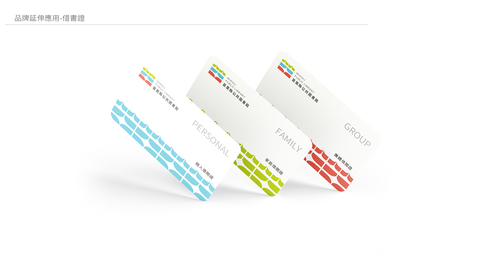
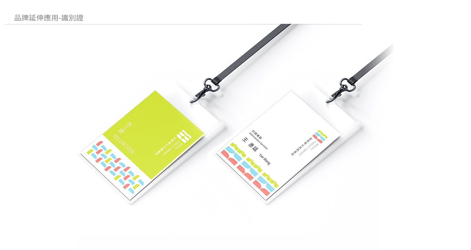
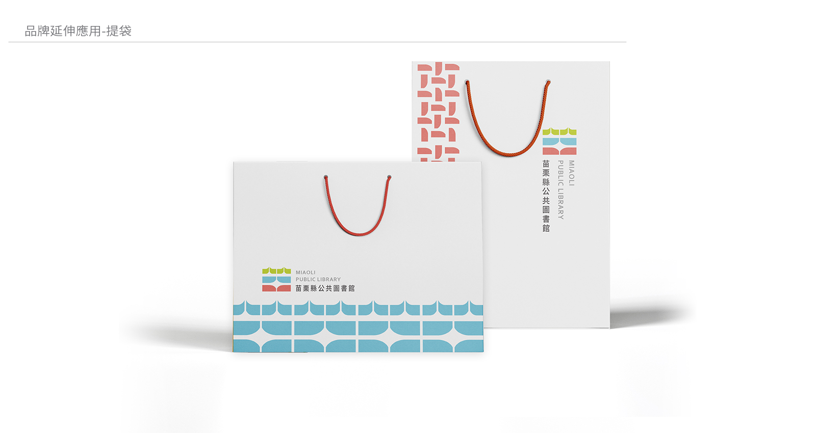
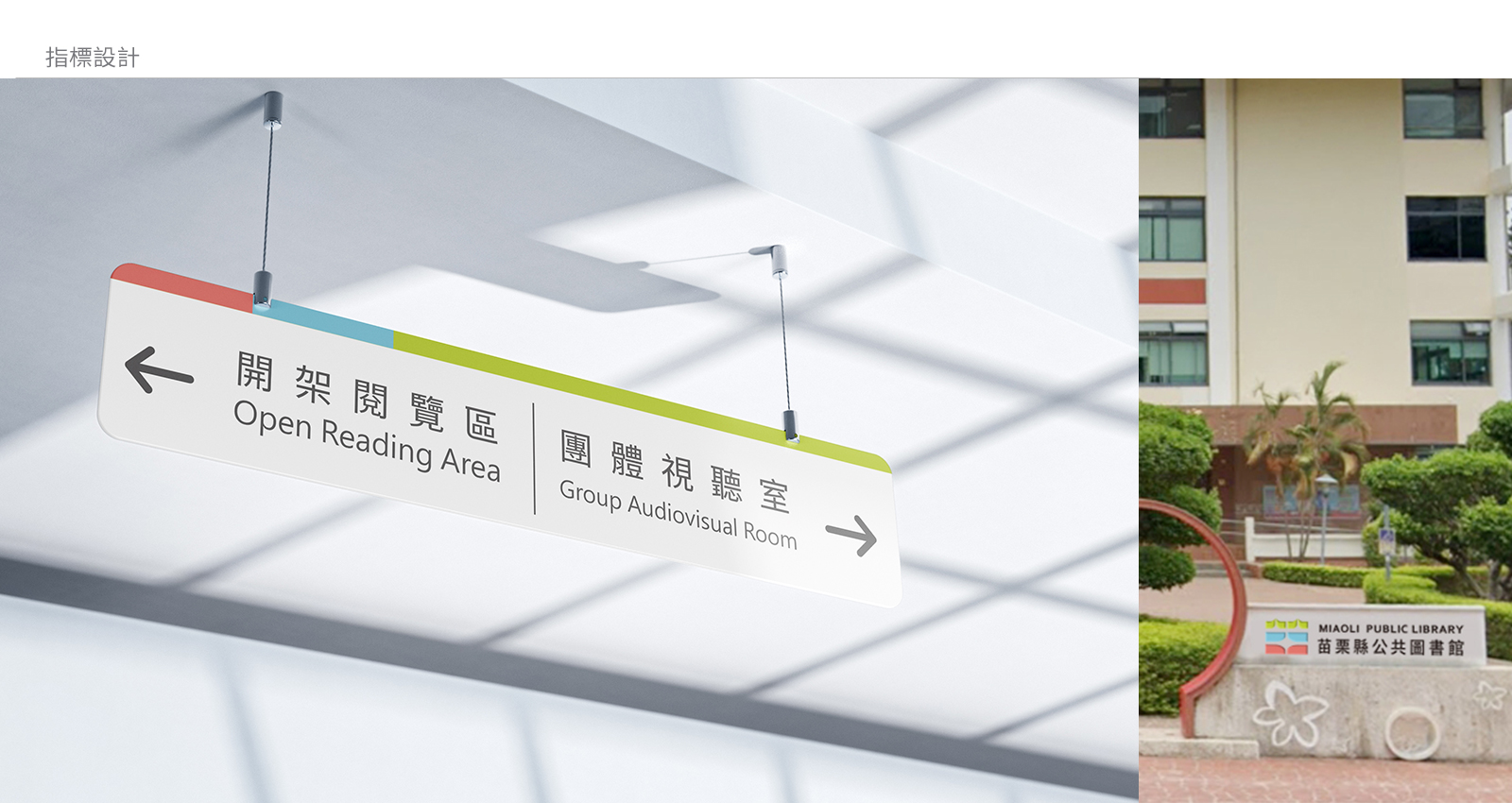
The branding application design for Miaoli Public Library emphasizes consistency and flexibility. Across various applications, such as business cards, membership cards, tote bags, and signage, the core elements of the logo are used in conjunction with the brand’s primary and secondary color schemes to maintain a unified visual identity system. On business cards and membership cards, different color blocks represent different service categories, making it easier for readers to identify and use. In tote bag design, the minimalist graphics combined with the brand logo and colors ensure practicality while enhancing brand recognition. For signage design, clear labeling and color usage improve the user navigation experience, embedding the brand image more deeply in the minds of the public.
ド、トートバッグ、案内表示など、さまざまな用途で、ロゴのコア要素がブランドの主要な色と補助色と組み合わされ、統一された視覚識別システムが維持されています。名刺や会員カードでは、異なる色のブロックが異なるサービスカテゴリを表し、読者が識別して使用しやすくなっています。トートバッグのデザインでは、ミニマルなグラフィックとブランドロゴおよび色が組み合わされ、実用性を確保しながらブランド認知度を高めています。案内表示のデザインでは、明確なラベリングと色の使用により、利用者のナビゲーション体験が向上し、ブランドイメージがより深く印象付けられます。